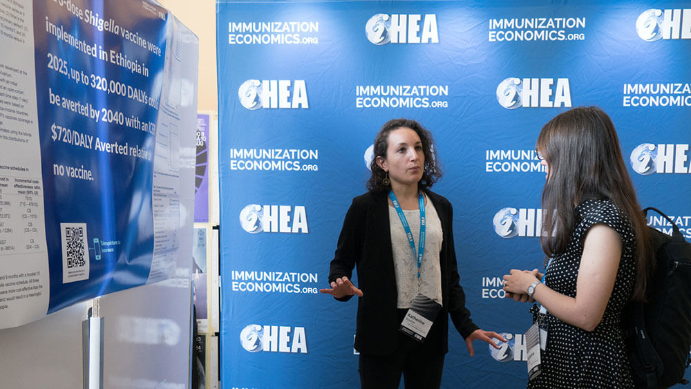
Katherine Rosettie discusses her scientific poster with another delegate at the Immunization Economics pre-congress prior to the 2019 iHEA World Congress in Basel. Organizers tweaked the poster presentations for the event. (Sitti Arlinda Rochaidi/Kremolens.com)
This case study is part of Convene‘s April CMP Series story looking at innovations in scientific and medical meetings.
2019 iHEA Immunization Economics Pre-Congress
July 13-14, 2019 Basel, Switzerland 1,500-plus attendees
When Chris Suharlim, M.D., MPH, director of public affairs at Immunization Economics and senior technical adviser at Management Sciences for Health, began organizing the iHEA (International Health Economics Association) pre-congress in Basel, Switzerland, in July 2019, he wanted to test a new approach to scientific posters. Instead of having participants use the standard poster design of long headlines and massive blocks of copy, Suharlim asked everyone to follow a new poster template that was designed by Mark Morrison, a Ph.D. student in psychology at Michigan State University. The template — which was explained in a YouTube video that has more than 456,000 views — features one bold headline to quickly communicate the main findings to attendees unable to parse all the inner workings of research.

Pre-congress organizer Chris Suharlim speaks to attendees at the event. He’s wearing one of his innovations for the event, a name badge/info booklet. (Sitti Arlinda Rochaidi/Kremolens.com)
“Our audience doesn’t have the time,” Suharlim told Convene. “They might see a poster during lunch or during a one-hour window that we allocate, but that’s not enough.”
More than 40 participants used the simplified template at the two-day pre-congress to present research about issues surrounding vaccinations for children. Suharlim said that the majority of presenters and attendees preferred the new design over other posters, and he is compiling data for a full analysis of how these posters impacted knowledge transfer.
The break from the traditional poster experience was part of Suharlim’s larger plan to make the conference more efficient and effective for attendees.
“The changes were an expression of frustration from some of the other conferences I have attended,” Suharlim said. “There are so many conference websites and presentations that are focused on the project and just [a chance for presenters to say] ‘Look at how great our research is.’”
Instead of focusing on giving presenters time with the microphone, Suharlim made a small adjustment to help attendees be more productive in their seats: Speakers used Google Slides — not PowerPoint — for their materials. “From the presenter’s point of view, their work feels the same,” Suharlim said. “From the attendee’s point of view, though, things are more streamlined because Google Slides give everyone access to the presentation in real time. With PowerPoint, they have to wait until after the meeting concludes to receive the slides. With Google, they can download the material immediately. There is no waiting.”

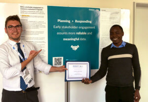
Gatien de Broucker (left) and one of his teammates, Anthony Ssebagereka, celebrate their best poster win at the 2019 iHEA pre-congress. Participants used a common poster style with QR codes for the event. (Courtesy Gatien de Broucker)
Suharlim also noted that QR codes helped simplify the attendee’s work. “We incorporate QR codes heavily,” he said. “When people are presenting, the first slide is a QR code, which helps people follow along separately on their phones.”
However, Suharlim pointed out that a better experience cannot always be found by unlocking a smartphone. “We are in global health, and our participants come from all over the world,” he said. “There is a big variance between high-income and low-income countries. For those from low-income countries, they may use flip phones or lack the latest mobile technology.”
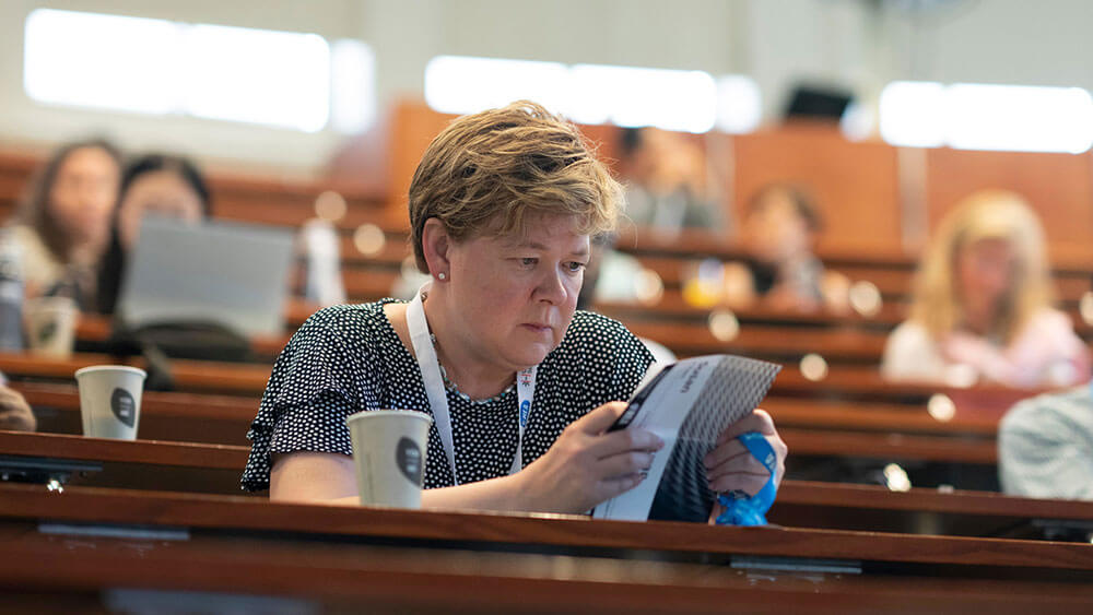
Even without a smartphone, they still needed a smart way to navigate the conference. So Suharlim turned name badges into small booklets with recommendations for the most relevant programming. “We all want to travel light from session to session, but we often get big books and tote bags filled with meeting materials,” he said. “The name-badge booklets included a list of sessions related to immunization economics that happened throughout the entire conference,” including the three days of programming after the pre-congress.
“Some conferences are so busy with 1,000 things happening and 30 different concurrent sessions,” Suharlim said. “The booklet was meant to help people maximize their time and absorb as much new knowledge as they could.”
All of Suharlim’s program tweaks were grounded in one guiding principle that all organizers can embrace: “It’s important to reframe the approach to understand who the audience is and what their pain points are. Start with the audience in mind first and go from there.”
David McMillin is an associate editor at Convene.

A pre-congress attendee looks at another innovation for the event, a booklet with session descriptions that was part of the name badges. (Sitti Arlinda Rochaidi/Kremolens.com)
Earn One Hour of CE Credit
By reading this case study and the others found in the April Convene cover story, you will be ready to earn one hour of CE credit toward CMP certification from the Events Industry Council. To take an online test to earn that CE credit.
