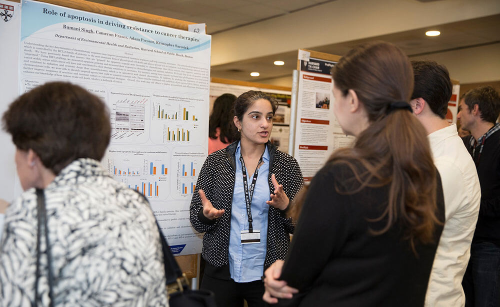
Harvard University students present their research during the school’s annual poster day. (Courtesy Christian Surharlim)
One of the most powerful pieces of knowledge shared at annual medical and scientific meetings is often not from the keynote presentation by a well-established luminary or a breakout education session featuring a panel of subject matter experts. Instead, some of the most promising and exciting developments in scientific and medical fields can be found in the poster hall where presenters — often some of the youngest participants on the registration list — display and discuss their new research findings. That potential, though, is being wasted, according to Mike Morrison.
As a Ph.D. student in psychology at Michigan State University, Morrison has gained experience attending conferences and presenting his own work. However, he took approximately one year away from a lot of that work to focus on crafting an animated YouTube video titled “How to create a better research poster in less time” and a template to resolve what he believes has been posters’ biggest shortcoming: terrible design. The average person is accustomed to reading short headlines and minimal copy on billboards to grasp a message, but posters — with lengthy headlines and massive blocks of copy — are a nightmare for digesting information.
“Not only are poster sessions kind of a lackluster experience for everyone involved, but they’re also really inefficient at transferring knowledge to people walking through the poster sessions,” Morrison said in the video. “That means it’s slowing down the learning. It’s slowing down scientific progress, which is actually holding the human race back in a non-insignificant way.”
Morrison’s template design — which is available for free — centers on one bold headline to quickly communicate the main finding to attendees scanning rows of posters. To learn more, he suggests including a QR code that links to more detailed information that attendees can review on their own time, away from the often-hectic conference environment.
Changing the Template
The video has attracted plenty of attention, amassing more than 218,000 views. One of those viewers was Christian Suharlim, M.D., M.P.H., a research associate at the Center for Health Decision Science at the Harvard University T.H. Chan School of Public Health, who used to think that posters could better connect his peers and help inform colleagues of the work they were each doing. “Part of the issue with being such a large school is that many researchers can wind up operating in silos,” Suharlim told Convene. “People are doing fantastic work, but many of them don’t know what other people in other departments are doing.”
In 2014, Suharlim helped to establish an annual poster day in an attempt to break those silos and offer “an opportunity for people at the school to come together to present what they’re working on.” However, the day didn’t measure up to Suharlim’s vision. “It’s very hard for people to quickly grasp all the insights from the posters,” he said. “We tried staggering the schedule, and we tried working with technology instead of printed posters. But I wasn’t convinced that any of the options proved to be a solution. Then, I saw Mike Morrison’s video.”

Dr. Christian Surharlim
The timing was perfect. In addition to his work at Harvard, Suharlim is the director of public affairs at Immunization Economics, an online platform that aims to connect researchers from around the world who are tackling issues surrounding vaccinations for children. He was in the midst of preparations to bring that online community together at the Immunization Economics iHEA pre-congress, an event in Basel, Switzerland that will include attendees from more than 75 countries from July 13-14.
The event will include a poster session with 40 pieces of research on everything from alternative financing models for vaccines to guidance on motivating mothers to vaccinate their children. Suharlim pointed out that capturing the full power of posters is especially essential for this audience. “We are a very young field,” he said. “We are trying to grow. We are trying to learn from each other as much as we could to ensure that vaccines get to children as efficiently as they can.”
Suharlim asked all the presenters to use the new template, and he also invited Morrison to oversee the presentations as a lead advisor for the poster session. It will mark the first full conference rollout of the template, with 40 posters from more than 20 countries adopting the new design. Suharlim was most excited about the fact that the new approach will save an attendee’s most valuable resource. “Our audience doesn’t have the time,” he said. “They might see a poster during lunch or during a one-hour window that we allocate, but that’s not enough.”
While the template is designed to simplify knowledge transfer, Suharlim acknowledged that the initial switch created one layer of complexities. “There are some learning curves,” he said. “We had to create an infrastructure that gives any attendee who scans the QR code a place to find more material from the posters.”
And outside of technology, the human resistance to change still exists. Since some of these presenters have already created a poster for other conference, a “better” design means more work. “There will always be people who do not want to invest more time to remake the poster,” Suharlim said. “But the majority of the feedback has been positive. We will be doing a more formal feedback process to gauge reactions, too.”
Those reactions will be important, but it’s what happens once attendees leave those poster halls that has greater signficance. “I really think that if everybody uses a design like this, we could accelerate the pace of science,” Morrison said in the video. “We could cure all diseases slightly sooner, and that’s everything to the people suffering from them.”
David McMillin is an associate editor at Convene,
